
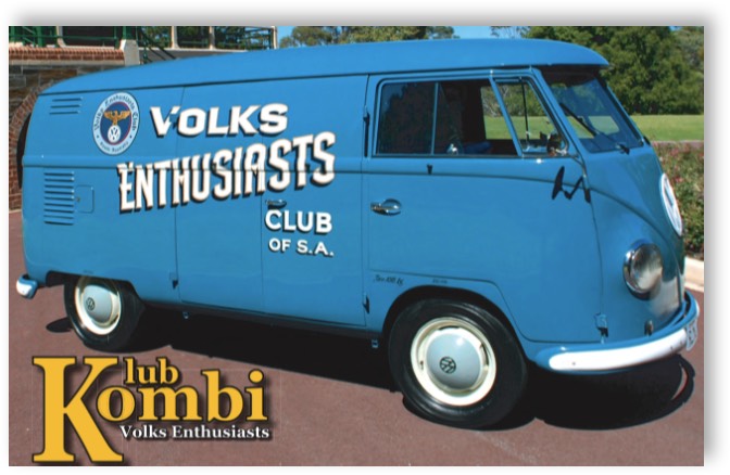
Volks Enthusiasts Club of South Australia
The Home of Genuine Volks Enthusiasm
LATEST INFORMATION


Zeitschrift Magazine
Date: 24/04/2026 Category: Magazines
April 2026 Club VeeDub Sydney Magazine link is now the Blog section
Blog Page Link: Click Here or the image.
Date: 24/04/2026 Category: Magazines
April 2026 Club VeeDub Sydney Magazine link is now the Blog section
Blog Page Link: Click Here or the image.

Magazines Online
Date: 30/03/2026 Category: Magazines
The current club magazine is now available. Click: Here or the image below.
For other issues, Click Here
If you have any stories, information or pictures you would like to share with others, please send them to editor@vecsa.com.au
Current deadline for stories/contributions for the magazine is 17/05/2026

Overview of Site Navigation
Date: 14/08/2025 Category: Information
The position of the menu has moved up into the header space to make it clearer.
In order to understand what is on the site, click the link below to view a hierarchal view.
Check Navigation for details.
Date: 14/08/2025 Category: Information
The position of the menu has moved up into the header space to make it clearer.
In order to understand what is on the site, click the link below to view a hierarchal view.
Check Navigation for details.
VECSA would like to thank our Platinum Sponsor

VECSA would like to thank our Silver Sponsors
© 2025 VECSA
Contact Webmaster
Website by martenit.com.au
Last Published: 24/4/2026